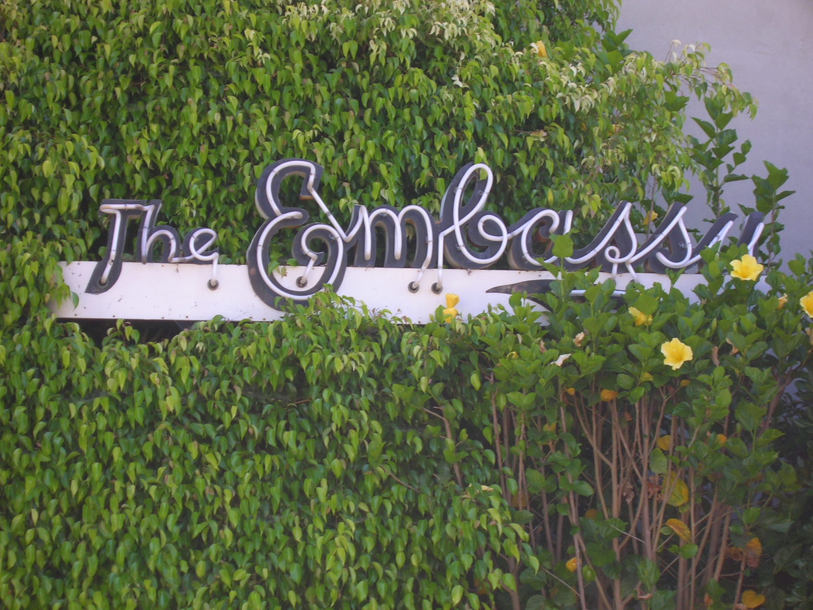
You know I love this stuff... I miss alot of those recognizable signs from my years stomping around Santa Monica. The KK posters are amazing, I wish they sold them.
Okay, one thing: careful with the too close cropping, lil Cropper Girl. You want the signage to be able to breathe, part of the original artistic typography choice includes what surrounds the letters themselves, the structure shape, the colors, wall texture, even the open air / elements around the building.


You know I love this stuff... I miss alot of those recognizable signs from my years stomping around Santa Monica. The KK posters are amazing, I wish they sold them.
ReplyDeleteOkay, one thing: careful with the too close cropping, lil Cropper Girl. You want the signage to be able to breathe, part of the original artistic typography choice includes what surrounds the letters themselves, the structure shape, the colors, wall texture, even the open air / elements around the building.
Graphic Design 101 lesson of the day! :)
Yes sir.
ReplyDelete